Outcome Indicators for Accessible Travel Framework
The data presented in the following section relates to the 31 of the 38 indicators specified in the Accessible Travel Framework for which measurement is available.
They are separated into four main outcomes:
- More disabled people make successful door-to-door journeys, more often
- Disabled people feel comfortable and safe using public transport
- Everyone involved in delivering transport information, services and infrastructure will help to enable disabled people to travel
- Disabled people are involved in the design, development and improvement of transport policies, services and infrastructure.
However, there are currently no measures developed to monitor the success of involving disabled people into decision-making processes regarding public transport.
More disabled people make successful door journeys, more often
This outcome includes nine indicators, although for three of those there is either no data available (i.e., for Use of ferry services and Multi-stage journeys), or the indicator became discontinued (i.e., Views on convenience accessing service – discontinued in 2016). The results for the remaining six indicators are discussed below.
Use of local bus services in the past month
The data for the two indicators examining the percentage of people using bus and train services in the past month come from the Scottish Household Survey, combining the years 2017 to 2021. Disabled people used the bus slightly more frequently than non-disabled people (40% to 36%). However, when looking at degree of disability, the most frequent users, 43%, were those whose condition only limited everyday activities a little. Those whose condition limited activities a lot used the bus no more frequently than non-disabled people (36%). [shown in Figure 23]
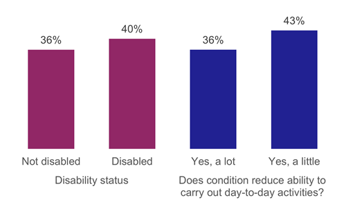
Figure 23: Percentage of people who used the bus in the last month, by whether adult is disabled and whether their condition limits their ability to carry out day-to-day tasks, 2017 to 2021 (combined)
Use of local train services in the past month
Unlike bus usage, which has been higher for disabled people than non-disabled people, the train is more likely to have been used in the past month by people who are not disabled (31%) than disabled people (17%). Those whose disability affects everyday activities the most are least likely to use the train (12%). [shown in Figure 24 below]
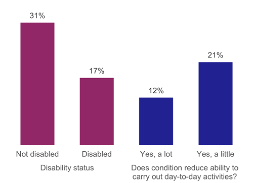
Figure 24: Percentage of people who used the train in the last month, by whether adult is disabled and whether their condition limits their ability to carry out day-to-day tasks, 2017 to 2021 (combined)
Whether experienced difficulties when changing from buses to other public transport modes
The Scottish Household Survey also enquires about the ease of change from buses or trains to other modes of public transport. There is only one data point available for each indicator, which reports the combined results from years 2016, 2019 and 2021 for buses.
Figure 25 indicates that a higher percentage of non-disabled people than disabled people agreed that it is easy to change from buses to other forms of transport (76% vs 64%, respectively). Likewise, more disabled people disagreed that it is easy to do this shift (8% vs 6%).
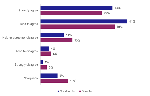
Figure 25: Easy to change from buses to other forms of transport by whether adult is disabled and whether their condition limits their ability to carry out day-to-day tasks, (2016, 2019 and 2021 combined)
Whether experienced difficulties when changing from trains to other public transport modes
Regarding the question of switching modes from trains to other public transport modes, there was little difference between the proportions of disabled and non-disabled people strongly agreeing that it is easy to make this shift (33% to 34% respectively). [shown in Figure 26 below]
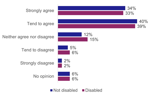
Figure 26: Easy to change from trains to other forms of transport by whether adult is disabled, (2016, 2019 and 2021 combined)
Factors discouraging public transport use
The following indicator also draws from the Scottish Household Survey data. This question was only asked in alternate years, and data for 2016, 2018 and 2020 are combined.
When asked to select the factors that discourage using the bus more often, Figure 27 indicates that the most common reason chosen by disabled people was health reasons (27%). In comparison, only 2% of non-disabled people stated health as the factor that discourages them from using the bus more often. The most likely reason for not using the bus more often among non-disabled people is the use of their own car (23%). This is also a common response given by disabled people, with 21% of listing car use as the reason for not using the bus more. The third most commonly chosen option for disabled people was no need to use the bus more often (16%), which was chosen by even more non-disabled people (22%).
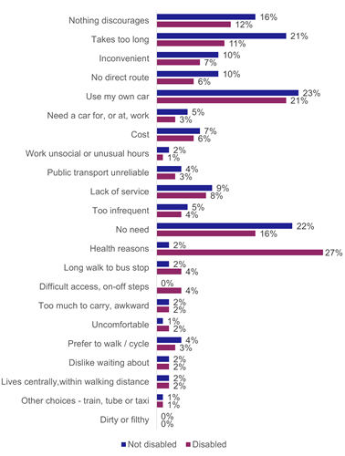
Figure 27: What discourages you from using the bus more often, by whether adult is disabled, (2016, 2018 and 2020 combined)
Satisfaction with distance of bus stop from beginning of journey
The final indicator for this outcome, to have more disabled people make successful door-to-door journeys, more often, examined people’s satisfaction with distance of bus stop from the beginning of their journey. The data for this measure comes from the Bus Passenger Survey, provided to Transport Scotland by Transport Focus.
The data available reflect passengers’ satisfaction measured in 2016 and 2018, and are presented in Figure 28. Overall, slightly fewer disabled people than non-disabled people claimed to be very or fairly satisfied with the distance of bus stop from their starting point (86% and 88%, respectively, in 2016, and 84% and 89%, respectively, in 2018). The proportion of those being fairly or very dissatisfied remained the same across both data points: % for disabled people and 3% for non-disabled people.
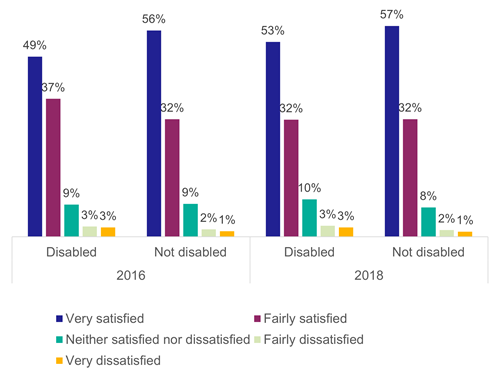
Figure 28: Satisfaction with distance of bus stop from the beginning of journey by disability status, 2016 and 2018
Everyone involved in delivering transport information, services and infrastructure will help to enable disabled people to travel
This outcome for the Accessible Travel Framework contains 12 indicators, but two have too small an overall sample size for Scotland to be reported (i.e., Whether used assistance on trains and satisfaction with assistance, and Whether train station met needs as a passenger with a disability or long-term illness). Thus, the remaining 10 indicators are discussed below.
Satisfaction with bus driver - helpfulness and attitude of the driver
The data for indicators enquiring about individuals’ satisfaction with helpfulness and attitude of the bus driver, and with time given by the bus driver to get to a seat comes from the Bus Passenger Survey and is available for years 2016 and 2018.
For satisfaction with the driver’s helpfulness and attitude, the majority of individuals were very or fairly satisfied in both years. The proportions were also similar based on the disability status (i.e. 77% of disabled and 78% of non-disabled people in 2016, and 80% of disabled and 82% of non-disabled people in 2018). [shown in Figure 29 below]
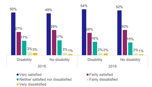
Figure 29: Satisfaction with bus driver helpfulness/attitude by disability status, 2016 and 2018
Satisfaction with bus driver - time given to get to the seat
Regarding the satisfaction with time given by the driver to get to a seat, again, the majority of individuals were very or fairly satisfied. In 2016, 80% of disabled and 81% of non-disabled people stated they were satisfied with the time given to get to a seat, which increased to 83% and 85%, for the two groups respectively, in 2018. [shown in Figure 30 below]
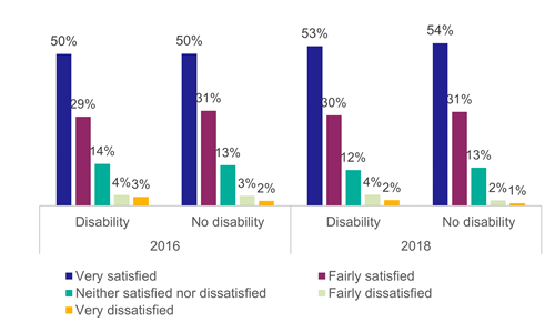
Figure 30: Satisfaction with the time the bus driver gave to get to a seat by disability status, 2016 and 2018
Views on the ease of finding out about routes and times (bus and train indicator combined)
The Scottish Household Survey asks about individuals’ view on whether finding information about bus and train routes and times is easy. Data for 2016, 2019 and 2021 was combined.
Figure 31 shows that a slightly smaller percentage of disabled people than non-disabled people considered finding out about public transport routes and times easy. For buses, the percentages were 81% for disabled people and 85% for those not disabled, and for trains, 87% and 91% respectively.
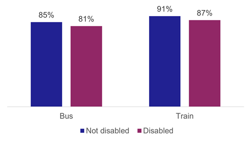
Figure 31: The percentage who agreed that finding out about bus and train routes and times was easy, by whether adult is disabled, (2016, 2019 and 2021 combined)
Number of accessible buses
The Scottish Government’s Scottish Transport Statistics publication provides information on the number and percentage of wheelchair accessible buses and taxis. This data is reported annually and indicates that, since 2019-2020, 100% of buses in Scotland were accessible or low floor buses. However, as Figure 32 shows, the total number of buses decreased from 4.4 thousand in 2019-20 to 3.7 thousand in 2020-21 and 2021-22.
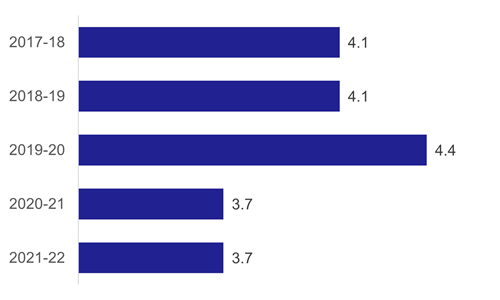
Figure 32: Number of accessible or low floor buses (thousands), 2017-18 to 2021-22
Number of wheelchair accessible taxis
Figure 33 shows a drop in the number of wheelchair accessible taxis from a fairly consistent 4,900 in each year from 2017 to 2020, to about 3,300 in 2021, followed by a rise to around 4,400 in 2022. [shown in Figure 33 below]
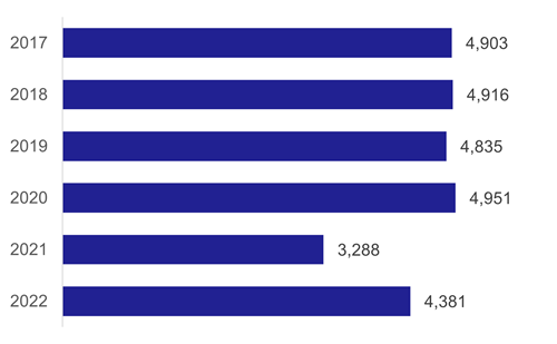
Figure 33: Number of wheelchair accessible taxis, 2017 to 2021
The proportion of wheelchair accessible taxis compared to the total number of taxis available increased slightly from 2017 to 2020 from 47% to 50%. This dropped in 2021 to 42%, but rose again in 2022 to 47%. [shown in Figure 34 below]
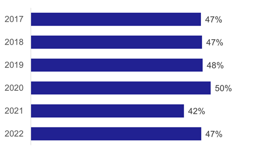
Figure 34: Proportion of wheelchair accessible taxis from total available, 2017 to 2023
Views on information provided at the bus stop
Bus and Rail Passenger Surveys, conducted by Transport Focus, provide data on individuals’ satisfaction with information provided at bus stop and on the bus, information about train times and/or platforms, and information provided during the train journey.
Figure 35 and Figure 36 show that slightly fewer disabled people were very or fairly satisfied with information available at the bus stop. 72% of disabled people and 77% of people who were not disabled were satisfied in 2016. 2018 percentages were similar, at 74% and 79%, respectively
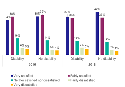
Figure 35: Satisfaction with information provided at bus stop by disability status, 2016 and 2018
Views on information provided inside the bus
70% of disabled passengers and 71% of non-disabled passengers reported being very or fairly satisfied with information given inside the bus in 2016. In 2018, these percentages slightly dropped for disabled people (68%), yet increased for those with no disability to 75%. [shown in Figure 36 below]
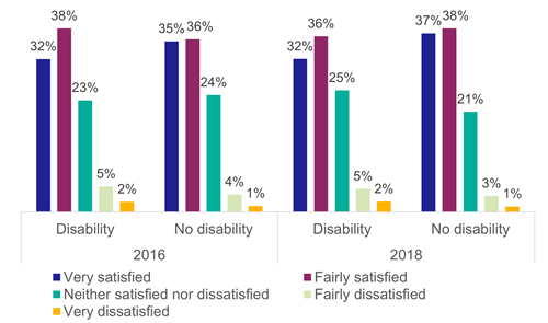
Figure 36: Satisfaction with information provided inside the bus by disability status, 2016 and 2018
Views on information provided about train times/platforms
When looking at passenger satisfaction with the available information about train times and/or platforms, the majority of disabled people reported being very or fairly satisfied (over 80% annually, since 2016). [shown in Figure 37 below]
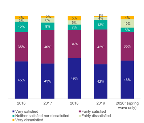
Figure 37: Satisfaction with information about train times/platforms (disabled people), 2016 to 2020
Looking at the passenger satisfaction among those with no reported disability, levels of satisfaction were higher, ranging from 87 to 89% from 2016 to 2019. In 2020, this increased to 91%, but this should be interpreted carefully due to a smaller overall sample size for 2020. [shown in Figure 38 below]
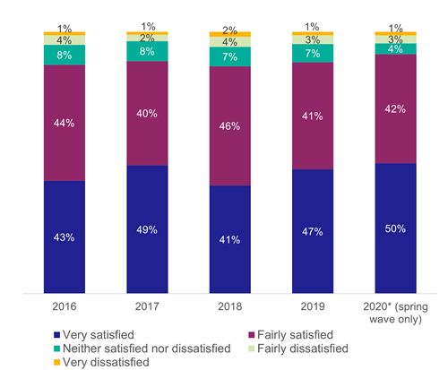
Figure 38: Satisfaction with information about train times and platforms (not disabled), 2016 to 2020
Views on information provided during the journey
Regarding the information provided to passengers during the train journey, the majority of disabled passengers were very or fairly satisfied. Since 2016, this indicator consistently showed levels satisfaction at 70% or over. [shown in Figure 39]
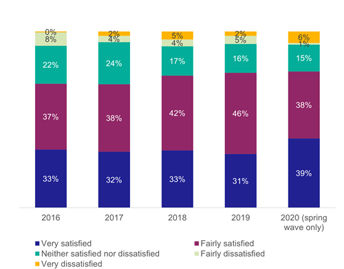
Figure 39: Satisfaction with information during the train journey (disabled people), 2016 to 2020
When non-disabled passengers were asked the same question, the proportion of participants saying they were very or fairly satisfied with information provided during their train journey was consistently 76% or higher. [shown in Figure 40 below]
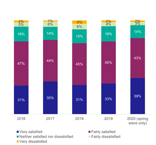
Figure 40: Satisfaction with information during the train journey (not disabled), 2016 to 2020
Satisfaction with public transport
Disabled and non-disabled people reported similar levels of satisfaction with public transport, 67% and 68% respectively.
Disabled people feel comfortable and safe using public transport
The third and final outcome contains 17 indicators, but one has too small overall numbers to be able to be broken down by disability (i.e. Whether experienced crime while travelling or near transport facilities and whether the incident was related to disability). Thus, the remaining 16 indicators are discussed below.
Views on toilet facilities on the train
The data for the next four indicators (i.e. views on toilet facilities on the train and at the station, and availability of staff on the train and at the station) come from the National Rail Passenger Survey conducted by Transport Focus. This survey ran biannually, typically having a Spring and an Autumn wave. In 2020 though, only the Spring wave was conducted because of the pandemic. Thus, data for some indicators are either hidden, due to having less than 75 responses, or should be interpreted with caution, due to a small sample size (between 75-99 responses).
Figure 41 demonstrates that, on average, over 50% of disabled and non-disabled passengers considered toilet facilities on the train either very or fairly good. There was a slight increase in rating among non-disabled passengers in 2019 and 2020, although the 2020 wave had a much smaller sample. The sample size was too small to provide data for this indicator for disabled people for 2020.
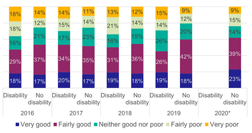
Figure 41: Rating of toilet facilities on the train by disability status, 2016 to 2020
Views on toilet facilities at the station
When enquiring about individuals’ rating of toilet facilities at the train station, a slightly lower proportion of people thought they were very or fairly good, between 40 and 50%. Roughly one in five individuals thought toilet facilities at the train station were fairly or very poor, regardless of their disability status. [shown in Figure 42 below]
Data for the year 2020 should be interpreted with caution, due to a smaller sample size.
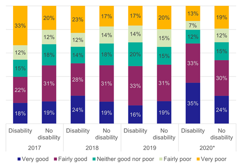
Figure 42: Rating of toilet facilities at the station by disability status, 2017 to 2020
Availability of staff on the train
Figure 43 shows rating of the availability of staff on the train, regardless of disability status as fairly or very good, was consistently 57% or higher. At the same time, at least one in five individuals stated that they were neutral on the matter; they found staff availability neither good nor poor.
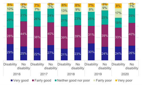
Figure 43: Rating of availability of staff on the train by disability status, 2016 to 2020
Availability of staff at the station
A higher proportion of respondents claimed availability of staff at the train station was good or very good, than it was on the train. For all years, since 2016, and regardless of disability status, at least 62% participants rated indicator good [see Figure 44 below]
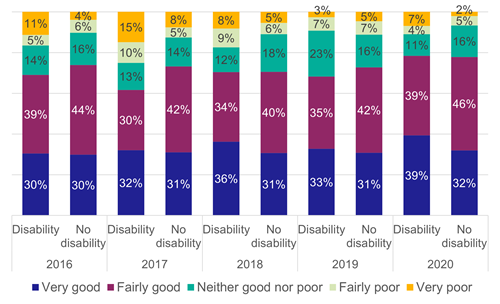
Figure 44: Rating of availability of staff at the station by disability status, 2016 to 2020
Satisfaction on bus with availability of seating
Figure 45 shows data from the Bus Passenger Survey, conducted by Transport Focus. This survey ran until 2019 and the only two data points available are 2016 and 2018.
Overall, the proportion of people satisfied with availability of seating or space to stand on a bus is 87% or higher. A slightly higher proportion (3%) of non-disabled people than disabled people say they are satisfied
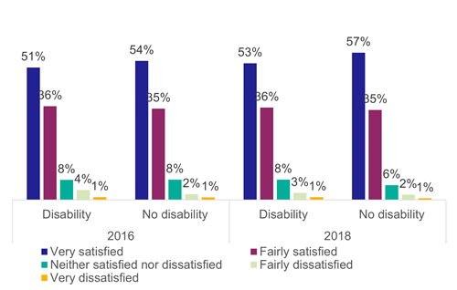
Figure 45: Satisfaction with availability of seating or space to stand (bus) by disability status, 2016 and 2018
Satisfaction on bus with comfort of seats
On the satisfaction with the comfort of seats on a bus, the difference in satisfaction between non-disabled and disabled people is 5%. However, Figure 46 shows that around 80% of people in each group were satisfied.
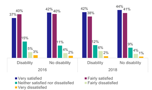
Figure 46: Satisfaction with the comfort of seats on the bus by disability status, 2016 and 2018
Satisfaction on bus with amount of personal space
Figure 47 presents data on individuals’ satisfaction with the amount of personal space on the bus. For both groups, 77% or more were very or fairly satisfied, with non-disabled people rating this indicator slightly more positively in both years examined.
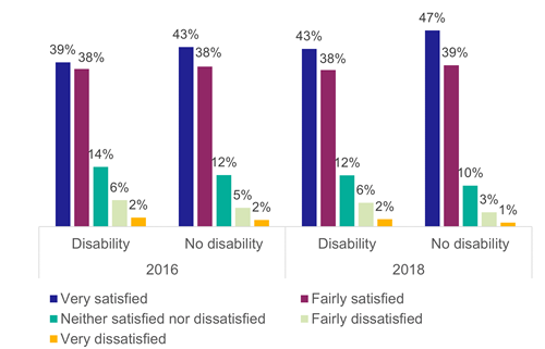
Figure 47: Satisfaction with the amount of personal space on the bus by disability status, 2016 and 2018
Percentage of buses with CCTV
Scottish Transport Statistics publishes data on the percentage of buses that have CCTV on board. This information is collected annually and presented in Figure 48. The proportion of buses with CCTV increased over the years from 82% in 2016-17 to 92% in 2021-2022.
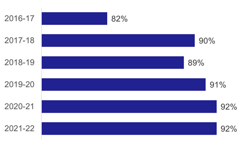
Figure 48: Percentage of buses in Scotland with CCTV, 2016-17 to 2021-22
Whether feel safe and secure on trains during the day
Information on the perception of safety on public transport and/or while waiting at the platform/station comes from two data sources. The phrasing of the question and any added specifics (e.g., time of day) depend on the source. The sample sizes also differ between different surveys and, as such, the percentage of people reporting feeling safe or unsafe might vary in comparison. For example, Figure 51, Figure 52 and Figure 54 present information on feelings of safety on the bus, but Figure 51 and Figure 52 look at the specific parts of the day compared to Figure 54, due to different sources used. Subsequently, the questions are phrased slightly differently and percentages will be different.
The first four indicators inquire about feelings of safety and security on public transportation using data from the Scottish Household Survey. The data combines the years 2014, 2016, and 2019.
Figure 49 presents analysis of feelings of safety and security on the train during the day. It shows that a higher proportion of non-disabled people reported feeling safe, although the percentage for both groups is high (96% and 92%, respectively).
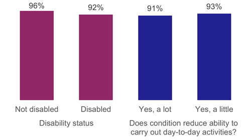
Figure 49: Feelings of safety and security on the train in the day, by whether adult is disabled and whether their condition limits their ability to carry out day-to-day tasks (2016, 2019 and 2021 combined)
Whether feel safe and secure on trains during the evening
Figure 50 indicates that feelings of safety and security on the train in the evening is lower than in the daytime. This drop is larger for people disabled people, where only 67% reported feeling safe, compared to 79% of non-disabled people.
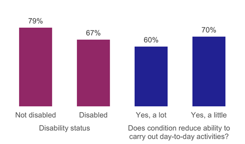
Figure 50: Feelings of safety and security on the train in the evening by whether adult is disabled and whether their condition limits their ability to carry out day-to-day tasks, (2016, 2019 and 2021 combined)
Whether feel safe and secure on buses during the day
The next indicator discusses feelings of safety and security on the bus during the day, and again demonstrates that perception of safety is high for both groups (93% and 94%, respectively). [shown in Figure 51 below]
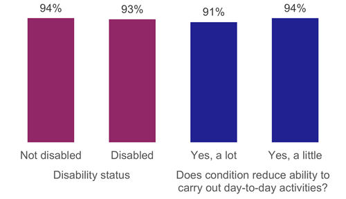
Figure 51: Feel safe and secure on the bus in the day by whether adult is disabled and whether their condition limits their ability to carry out day-to-day tasks (2016, 2019 and 2021 combined)
Whether feel safe and secure on buses during the evening
However, as with rail, Figure 52 shows that the perception of safety is lower when using buses in the evening. Again, non-disabled people reported feeling more safe than disabled people (74% vs 59%). Overall, the perception of safety seems slightly higher for trains than buses (93% vs 92% for disabled people, and 96% vs 94% for non-disabled people during the day). This difference is starker for evenings, when 67% of disabled people feel safe on trains, but only 59% do so on buses. Likewise, 79% of non-disabled people reported feeling safe on trains, and 74% reported so for buses. [shown in Figure 52 below and Figure 50 above]
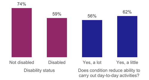
Figure 52: Feelings of safety and security on the bus in the evening, by whether adult is disabled and whether their condition limits their ability to carry out day-to-day tasks (2016, 2019 and 2021 combined)
Views on personal safety while at bus stop
The Bus Passenger Survey, which was run by Transport Focus until 2019, is the second data source that enquires about personal safety at a bus stop and on the bus. Figures are available for 2016 and 2018.
Figure 53 shows that the majority of people claimed to feel very or fairly safe at the bus stop (80% or higher). This was relatively consistent regardless of the disability status.
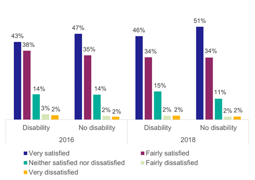
Figure 53: Satisfaction with personal safety while at bus stop, by disability status, 2016 and 2018
Views on personal safety while on bus
Likewise, when asked about personal safety on the bus, an even higher proportion of people stated feeling very or fairly satisfied (85% or higher). [shown in Figure 54]
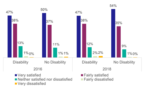
Figure 54: Satisfaction with personal safety while on bus, by disability status, 2016 and 2018
Views on personal safety while using the train station
Data on individuals’ views on personal safety while using the train station and while on the train come from the National Rail Passenger Survey conducted by Transport Focus.
Figure 55 indicates that for all years, 73% or more respondents rate personal security while at the train station as very or fairly good, regardless of disability status. However, around one in five said that their personal safety is neither good nor bad.
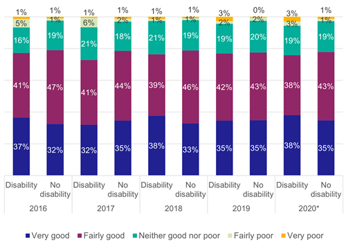
Figure 55: Perceived personal security while using the train station, 2016 to 2020
Views on personal safety while on the train
Regarding personal safety while on the train, the National Rail Passenger Survey reports that around 80% of respondents claim to feel very or fairly safe. The preceding question changed in spring 2017, which could have affected results of this question from that time. The lowest percentage was 74%, reported by disabled people in 2017. The percentage feeling safe is lower than that for buses. [shown in Figure 56 below]
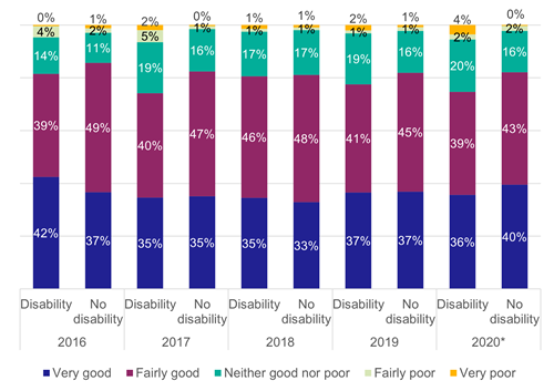
Figure 56: Perceived personal security while on the train by disability status, 2016 to 2020