4. Personal Travel
Transport and Travel in Scotland Results from the Scottish Household Survey
4. Personal Travel
Who Travels?
The proportion of adults who travelled the previous day is dropping over time.
Around three quarters (73%) of adults travelled the previous day. This has decreased from 79% in 2008. [Table TD1]
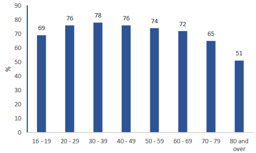
As in previous years, Older people were less likely to have travelled the previous day than younger age groups. [Table TD1 and Figure 1]
As in previous years, in 2018 men were more likely to have travelled than women (74% vs 72%) [Table TD1]
Figure 1: Percentage of adults travelling the previous day by age, 2018
How Do People Travel?
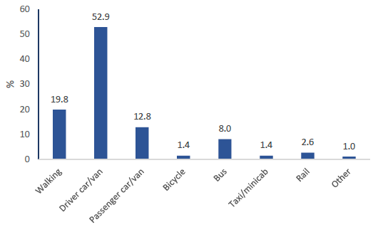
Over half of journeys are made by driving a car or van (53%, up from 48% in 2012). Walking is the next most popular mode of transport (20% of journeys, down from 26% in 2012), followed by passenger of car or van (13%) and bus (8%). [Table TD2, Table SUM1, and Figure 2]
Figure 2: Modal share of all journeys, 2018
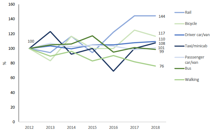
Although rail travel makes up only a small proportion of total journeys, the percentage of journeys that are made by rail has increased since 2012. Walking journeys have decreased [Table SUM1 and Figure 3].
Figure 3: Indexed modal share of journeys, 2012-2018 (2012=100)
Multi-stage journeys
Individual journeys can be broken down into different stages, where, for example, the traveller switches to a different mode of transport.
Only around three per cent of journeys reported in the Travel Diary in 2017 were multi-stage. [Table TD2c]
Multi-stage journeys were most common where the journey involved ferry or air travel. [Table TD2c]
Why Do People Travel?
Most journeys were for the purpose of commuting (24%), shopping (23%) or visiting friends or relatives (10%). [Table TD3].
There has been little change in the proportion of journeys made for each purpose since 2012.
Travel to Work
How do people travel to work?
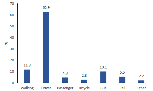
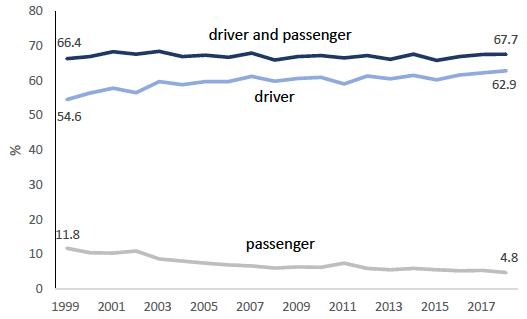
Sixty-eight per cent of people usually travelled to work by car or van, either as a driver (63%) or passenger (5%). Twelve per cent of people usually walked to work. Ten per cent of people usually took the bus and six per cent travelled by rail. Three per cent of people usually cycled to work in 2017. [Table SUM1 and Figure 4]
Figure 4: Method of travel to work, 2018
Although the combined car/van driver and car/van passenger percentage has changed relatively little since 1999, within this the percentage of drivers has increased from 55% to 63%, and passengers has decreased from 12% to 5%. Rail travel has increased from 3% to 5% over this period. [Table SUM1 and Figure 5]
Figure 5: Percentage usually travelling to work as a driver or passenger of a car or van, 1999-2018
Who travels to work by which mode?
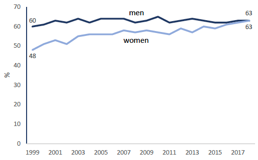
In 1999 a greater proportion of men than women drove to work (60% compared to 48%). The gap has now closed with the figures equal at 63%. [Table 7 and Figure 6]
Figure 6: Percentage of men and women driving to work, 1999-2018
In 2018 women were more likely than men to walk or catch the bus to work. Men were more likely to cycle to work. [Table 7]
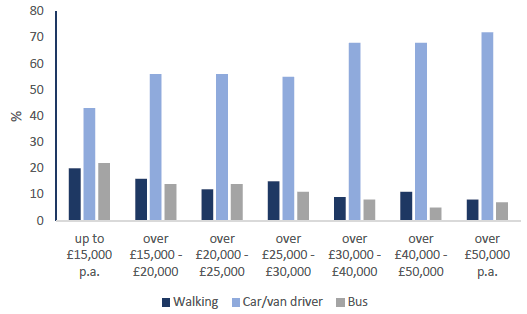
People in lower income households were more likely to walk or take the bus to work than those in higher income households. People in higher income households were more likely to drive. [Table 7 and Figure 7]
Figure 7: Percentage of people taking the three most common methods of travel to work by household income
People in rural areas were also more likely to drive than those in urban areas. Younger people (aged 16 to 29) were most likely to take the bus. [Table 7]
White Scottish and White other British people were more likely to drive than most other ethnic groups and less likely to take the bus. [Table 7]
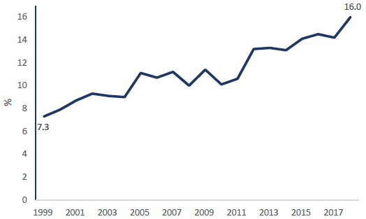
There has been an upward trend in the percentage of employed or self-employed adults working from home, rising from 7% in 1999 to 16% in 2018. [Sum 1 and Figure 8]
Figure 8: Percentage of employed or self-employed adults who are working from home, 1999-2018
Why do people choose these modes?
Relatively few people have changed the mode of transport they used to get to work in the past year. Of all the modes, driving showed least change. Based on data for the last 5 years, of those who drove to work a year ago, 97 per cent still drove to work [Table 10]
The main reasons given by respondents for changing their usual mode of travel to work in 2018 were changing job (30%) and moving house (24%). [Table 10a]
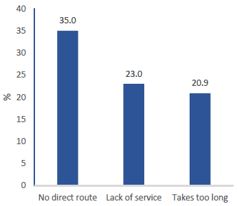
Of those who drove to work, fifty three percent said they could not use public transport to work. For those who did not use public transport but could, the main reasons given were: takes too long (45%), no direct route (23%), inconvenient (20%) and prefer to use car (16%). For those who did not use public transport and could not, the main reason were: no direct route (35%), lack of service (23%), takes too long (20%). [Table 14, Figure 9, and Figure 10]
Figure 9: Reasons why those who drove to work and could use public transport did not, 2018
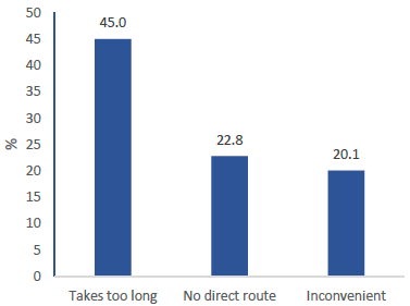
Figure 10: Reasons why those who drove to work and could not use public transport did not, 2018
Travel to School
How do children travel?
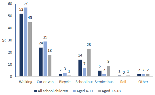
Around half of children (52%) walked to school, nineteen per cent travelled by bus and around a quarter (24%) travelled by car. [Table SUM1]
There was variation in mode of travel by age. In the 4 to 11 age group, 57 per cent reported walking to school, compared to 45 per cent in the 12 to 18 age group. The older age group were more likely to catch a bus than younger children (33% compared to 9%). [Table 15 and Figure 11]
Figure 11: Method of travel to school, 2018
The Sustrans Hands Up Scotland publication also covers travel to school. Due to the use of different categories, it is not possible to make a direct comparison with the Scottish Household Survey: http://www.sustrans.org.uk/scotland/what-we-do/schools-and-universities/hands-scotland.
Why do parents choose these modes?
Of those walking, eighty nine per cent did so because the school is close by. Of those travelling by car, most parents used this because it was the most convenient mode (36%). Parents also chose to use the car to take their children to school because it was too far to walk (15%) and because it was the safest method (18%) or the quickest method (19%) [Table 16]
‘Most convenient’ was the most popular reason for children traveling by school bus (40%) and service bus (38%). The second most popular reason for those who travel by school bus (21%) or service bus (24%) was that it was too far to walk. [Table 16]
When Do People Travel?
Slightly more journeys were reported on weekdays than at weekends. Sixteen per cent of journeys were on Fridays, the most popular day to travel, whereas only 12% were on Sundays. [Table TD8]
Peak travel on a weekday was between 7 am and 9:30 am (20% of weekday journeys started between these times). The busiest time for travel on the weekend is between 12 noon and 2pm, with just under a quarter (23%) of weekend journeys taking place between these times.
There has been little change in these travel patterns reported in the survey over recent years. [Table TD7 and Table TD8]
Duration
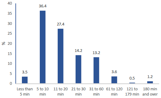
The majority of journeys reported in 2017 were of short duration. Sixty seven per cent of journeys lasted up to 20 minutes. Only nineteen per cent of journeys lasted more than half an hour, of which around five per cent lasted more than an hour. [Table TD6 and Figure 12]
Figure 12: Percentage of journeys made by duration of journey, 2018
Perceptions of Congestion
Thirteen per cent (13.0%) of car driver journey stages[1] were perceived to be delayed due to congestion in 2017. This compares with 12.8% in 2017. [Table TD10 and Sum1]
Eleven per cent of bus stages were delayed due to congestion, similar to the figures for the recent years. [Table TD11]
The main reason suggested for car or van stage delays was ‘volume of traffic’ (78%). [Table TD10a]
Over the combined three year period from 2016 to 2018, the travel diary’s reported congestion figures were highest for commuting (22%) and business travel (18%) stages. Weekday journey stages were more frequently affected by congestion than weekend stages. As might be expected, the morning and evening peak periods on weekdays saw the highest proportion of driver journey stages delayed by congestion. [Table TD12]
Questions in the social survey, which focused only on commuting congestion, found that over the combined five year period from 2014-18, 34% of all journeys to work were perceived to be affected by congestion at least once a week. This figure was higher for both car/van drivers (44%) and bus passengers (44%). [Table 8]
Where Do People Travel?
When looking at travel between areas of Scotland, fourteen council groupings are used. Some councils are merged to preserve sufficiently large sample sizes.
In the combined period from 2012 to 2018, most journeys in Scotland started and finished in the same local authority grouping. The proportion was highest in the Grampian group (Aberdeen City, Aberdeenshire and Moray) and Highlands and Islands, where this was the case for 97% of all journeys. The proportion of journeys starting and finishing in the same area was lowest in South Lanarkshire (71%) and Glasgow (72%). [Table TD13 and TD14]
How Far Do People Travel?
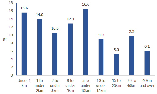
The majority of journeys recorded in 2018 were short. Sixteen per cent of journeys were under 1 km, and more than half (53%) of journeys were under 5 km. These numbers are broadly similar to recent years. [Table TD4 and Figure 14] The median journey length was 4.5 km and the mean journey length was 11.4 km. [Table TD5]
Figure 14: Percentage of journeys by road network distance, 2018
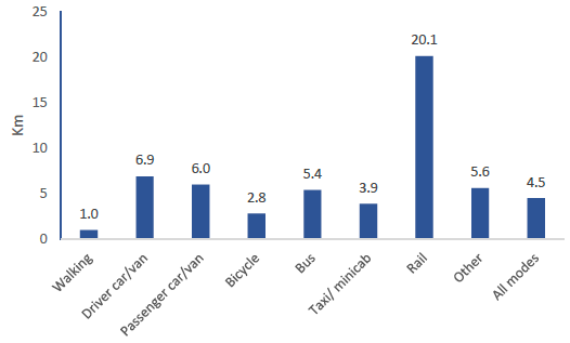
Walking journeys had the shortest average (median) length (0.9 km), with cycling next lowest at 2.7 km. The median car/van driver journey was 6.8 km, bus journeys averaged 5.2 km and rail journeys had the longest median length at 17.3 km. [Table TD 5a and Figure 15]
Figure 15: Average (median) distance by method of transport, 2018
The median length of journey for men (4.6 km) was not greatly different from that of women (4.3km) but the longest journeys of men (upper decile 33.4 km) were further than those of women (24.5 km). [Table TD5a]
Sixty two per cent of journeys under 1 km were made on foot; car journeys (whether as a driver or passenger) accounted for most of the remainder (34%). Car was the most common mode of travel for all distance groupings greater than 2 km. [Table TD2a]
Influence of Ordering Services on Travel
Where individuals had used ordering services to have goods delivered the previous day, they reported a reduction in the number of trips they made that day in fifty-six per cent of cases. [Table TD17]
The most popular ordering service was internet shopping, which was used the previous day by 7% of the population, followed by takeaway food delivery (3%). Thirty to thirty-nine years olds were the most frequent users of internet shopping (10%). Takeaway food delivery was most popular with twenty to twenty four year olds (7%) and sixteen to nineteen year olds (6%). People aged over 80 used ordering services least. [Table TD17]